Here's where we left my first girl:
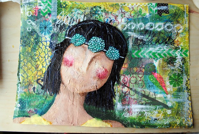
It was the background that was bugging me. Although I really do love it - there's so much texture going on and that little bird is too cute - it's a little overpowering. Our girl looks lost in a jungle instead of lost in her thoughts. I wanted the background to be more serene, more peaceful... so I whitened it out. Yes! All of it (almost) gone!
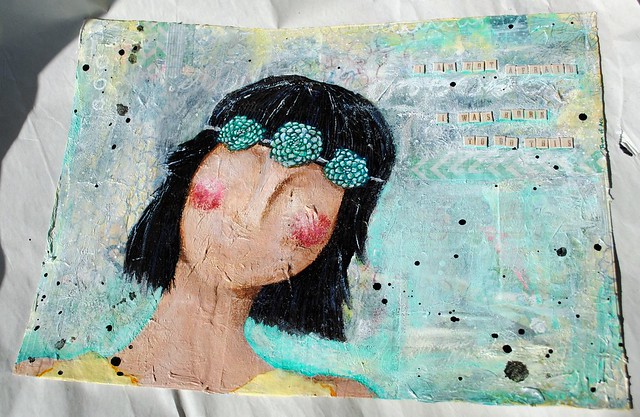 Isn't that just so much better? Before, the busyness left me a bit breathless - now it makes me take a deep breath and smile. There are still a few finishing touches needed here: the outline of her hair needs to be touched up and the lower-right part is still bugging me a bit. There's too much turquoise in there. And the quote needs to pop a tiny bit more.
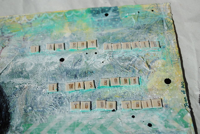
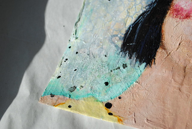
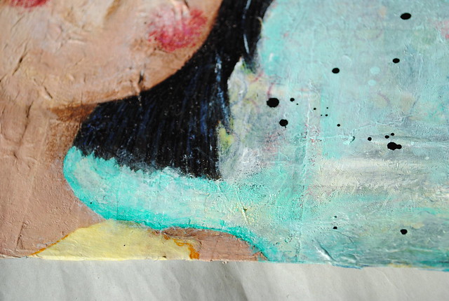
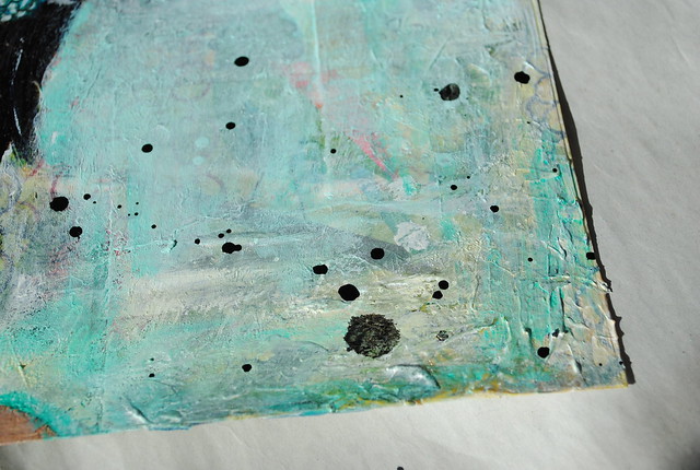 I was going to make those small finishing touches this morning and post those photos along with these, but I feel more led to start a new girl... and so a new girl I will start!
What do you think of my drastic change?

It was the background that was bugging me. Although I really do love it - there's so much texture going on and that little bird is too cute - it's a little overpowering. Our girl looks lost in a jungle instead of lost in her thoughts. I wanted the background to be more serene, more peaceful... so I whitened it out. Yes! All of it (almost) gone!


What do you think of my drastic change?

2 comments:
Sometimes a drastic change is called for :) There's been a lot going on for you lately, and maybe the (original) background was over powering and cluttered (although totally beautiful - probably could have been a stand alone abstract painting :) ... but maybe it was just getting all that pent up stuff inside of you, out onto the paper...and then now that you're in a 'calm', your painting was ready for the calm.
I think the hint of teal works wonderfully with her dark hair.
ps. I have those word / letter stickers too!! :D ... who knows where they are in all my art clutter though.... hehe.
I love the headband.
Post a Comment