Angie received our sketchbook a while ago, so it's about time I get these photos posted. I didn't get as much done as I wanted to this go round - our move and starting my new job sort of got in the way. Still, the project is coming along quite nicely and we should definitely be able to finish on time.
You can see my previous updates here: Part 1, Part 2.1 and Part 2.2 - and Angie's updates here: Part 1 and Part Two
[warning: picture heavy post coming up!]
Let's start with the pages I prepared for Angie to work on. The first is a double spread:
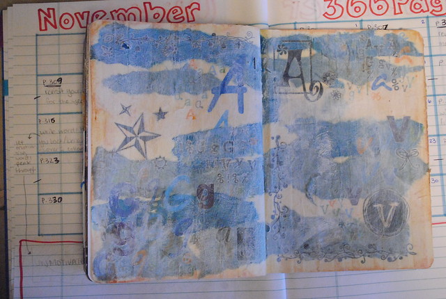
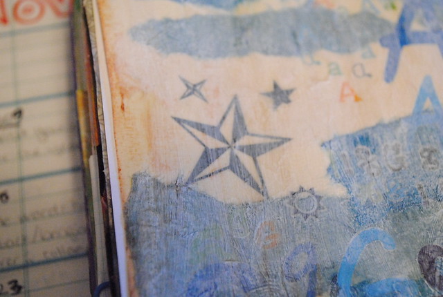
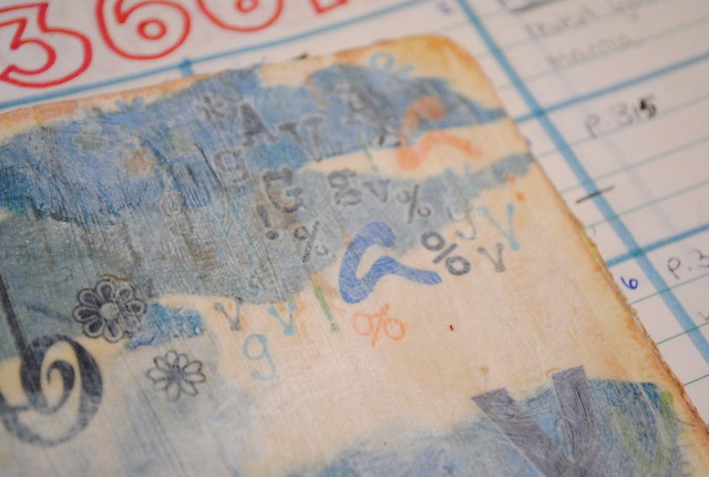 I started by striping the pages with masking tape and covering it with gesso and an assortment of torn blues and tan tissue paper. Next I went a little crazy with rub-ons, adding a bunch of A, G & V letters (our initials) and lots of symbols and images. A light white wash and "tea-stained" edges (using a Distress Ink stamp pad in tea-stained) finished my background for Angie's finishing touches.
I also started a left-right spread for Angie to work on:
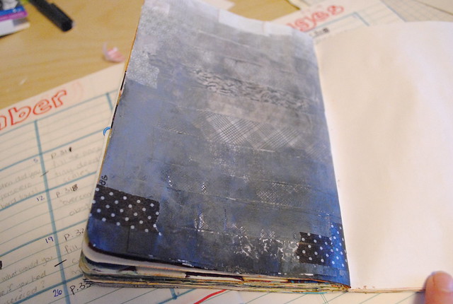
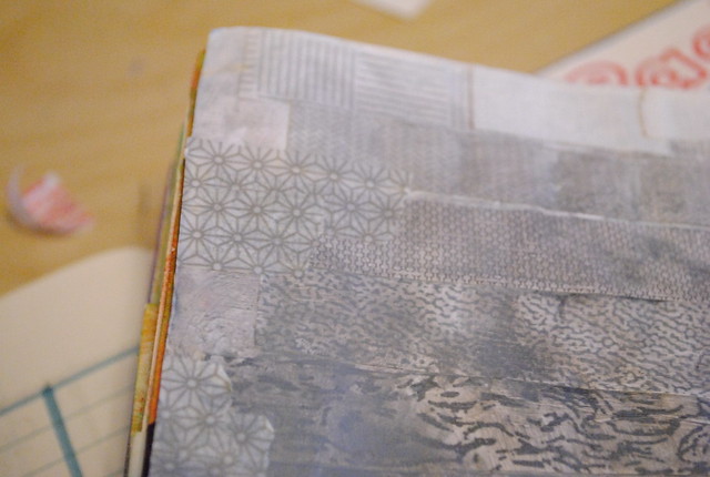
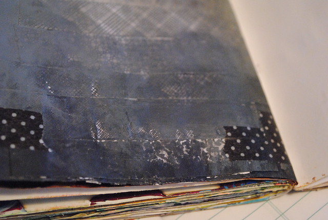 For this one, I knew I wanted to make a gradient / ombré with a collage covered with paint (as you can see, I also added a bit of washi tape on top). Trying to decide on a colour scheme, I flipped through the sketchbook. It is LOADED with colour... so I decided to go with a grey page for a little break. Plus, Angie can go crazy with colour on her page if she likes!
Next are a couple of spreads that I finished after Angie's input.
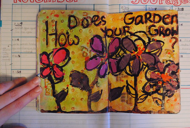
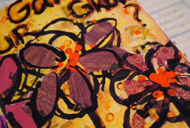
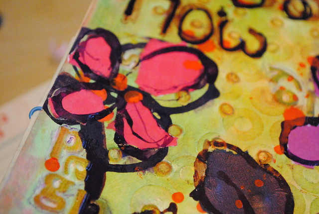 For this page, I transformed the lovely textured background into a fall-toned garden. I used drippy India ink in brown, violet and orange and collaged the flower petals and leaves in bright pinks and purples. A familiar (if slightly wonky) phrase finished the page.
Following along nicely is this left-right spread:


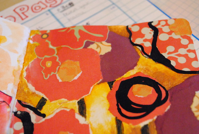 The collaged flowers are a mix of torn "circles" and cut-outs from patterned paper. I finished by painting in stems and a yellow background and used black India ink to highlight a few of the flowers.
I have one final page to show but this post is getting long enough - plus, it's good enough to deserve its own post.
What do you think of our sketchbook collaboration so far?
You can see my previous updates here: Part 1, Part 2.1 and Part 2.2 - and Angie's updates here: Part 1 and Part Two
[warning: picture heavy post coming up!]
Let's start with the pages I prepared for Angie to work on. The first is a double spread:


I also started a left-right spread for Angie to work on:


Next are a couple of spreads that I finished after Angie's input.


Following along nicely is this left-right spread:


I have one final page to show but this post is getting long enough - plus, it's good enough to deserve its own post.
What do you think of our sketchbook collaboration so far?

No comments:
Post a Comment