My friend Angie, from jellybeans, has been blogging a Monday Art Class for the last few weeks. Last week's class had us drawing our chairs, from all sorts of different perspectives. We then used our sketches this week to make a painting using complementary colours.
So.... here's my coursework:
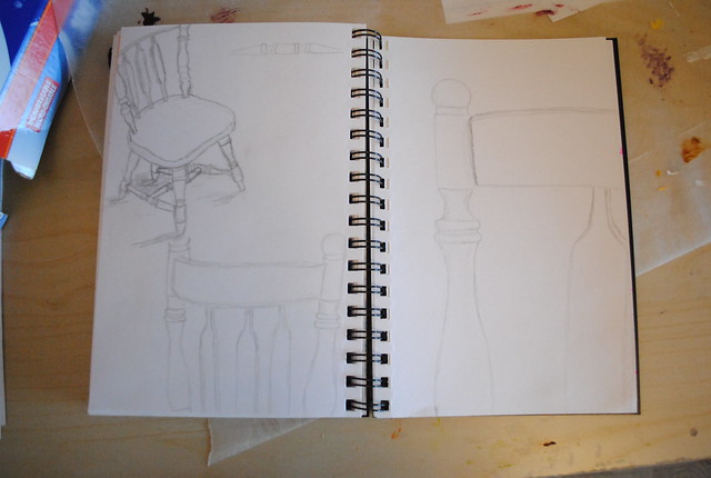
First, my sketches. I used one of the chairs that goes with our kitchen table & drew it from a few different angles. Since I did this today instead of last week, I had an idea of where I was going with this. As soon as I started, I knew what cropped perspective I was going to paint.
So I got right on it. Sketched out the chair on canvas, mixed some paint & got started. Here it is with the background & chair blocked in:
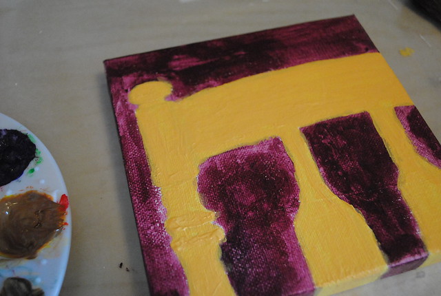
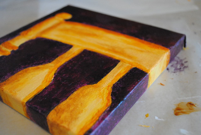
I chose yellow & purple as my complementary duo & mixed a gorgeous plum for the background & bright gold for the chair.
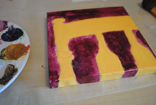
I next used a darker, bluer purple to add some depth to the background. Finally, an orange-gold & yellow-tan were used to add in some details & shading:
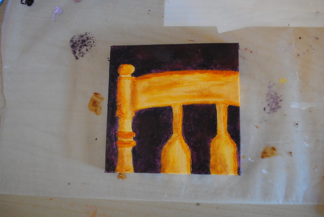
I'm actually really happy & a little surprised at how well this turned out. I think this may be my first painting without any added collage elements... and I think it looks pretty darn good!
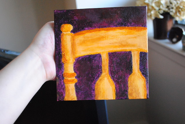
I like using these wrapped canvasses - I always stretch my paintings around the sides to give it an interesting depth on the wall. I have another one in the same size as this one; I'm tempted to paint another chair in blue-orange to go with this one!
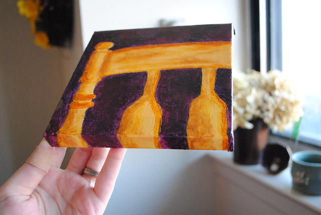
I laid the paint on thickly for extra texture.
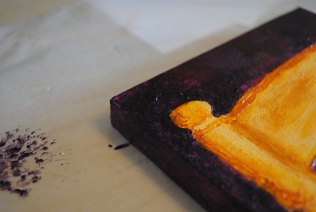
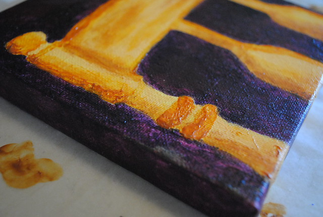
I typically "finish" my paintings with charcoal outlines, but I don't think I'll do that with this one. I'm loving the loose, abstract-y feel. I definitely think I'll be making a second one.
Thanks for the fun class Angie! Looking forward to next week!

3 comments:
It turned out so well! :) You simply can't go wrong with complimentary colours lol. I'm really liking the dark purple that you mixed up, it has beautiful depth to it! If you really like texture with your paint, you should try some gel medium or some pastes - you could really build it up then.
ps. you in particular are really going to like next weeks ;)
I really like it - the colors really play off each other! Nice job!
I like it a lot! the finished drawing of the chair too.
Post a Comment